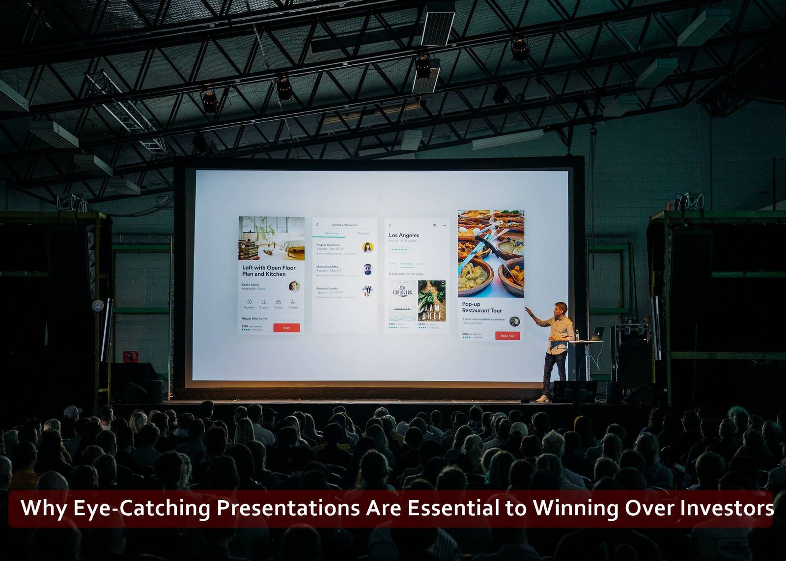
Presentations are a key aspect of operating a business. Whether you are presenting a venture to a potential investor, presenting ideas to a new client, or presenting ideas to team members, a good presentation can influence audiences in impactful ways.
Your presentation demonstrates your professionalism and level of expertise to your audience—it doesn’t only communicate your ideas. It is a reflection of you as a professional. For this reason, good presentation design is crucial.
Those who do not feel that they have enough design experience should consider hiring presentation designers to create an eye-catching presentation that wins over investors.
Demonstration of Expertise
Your presentation is a demonstration of your personal expertise. You know what you are talking about, and you need to convince your audience that you are an expert in your field.
However, if you present them with a disorganised, thoughtless presentation, you aren’t going to come across as an expert. Instead, audiences may find your presentation confusing and potentially distracting.
Audience Comprehension
Your presentation will only be impactful if it is easy for your audience to follow. The last thing you want to do is create slides that are disorganised and difficult to follow. If the audience loses the thread for just a few seconds, it becomes increasingly difficult to recapture their attention. For this reason, you should focus on making your presentations easy to follow.
Include a compelling introduction, provide evidence in the form of facts and statistics and then sum up your points at the end. In addition, you should be mindful of the number of words you include on each slide.
Generally, less is more—too many words may lead to the audience reading from your slides instead of listening to what you have to say.
Brand Reinforcement
Your presentation reinforces your brand values. They are an extension of your company, so you should invest plenty of time getting your presentation right before you get in front of the audience.
Essentially, your presentation should feel like your brand. People pay considerable attention to how your brand looks and feels. For this reason, you need to pay attention to the tone of voice of the copy on the slides and fonts, colours, logos, and other branding.
For example, if your brand uses a friendly, informal tone in other marketing communications, but your presentation is formal in its tone, you may confuse your audience. Consistency is key.
Why Should You Hire Presentation Designers?
Enlisting the help of a presentation design agency gives you more time to focus on the copy and practice your script before the presentation. With an expert focusing on design, you can spend more time searching for useful information and statistics to back up your main points.
How to Create an Eye-Catching Presentation
Creating an eye-catching presentation that will pique investors’ interest is no walk in the park—you need to spend plenty of time perfecting your messaging and design. The following tips will help you design a compelling investor presentation:
Keep it simple
You need to convey the personality of your business without going too over the top. A garish, busy presentation might distract your audience or, in the worst-case scenario, make them lose interest entirely. For this reason, it’s vital that you keep the presentation design relatively simple.
If you have not yet created branding guidelines, choose two or three colours that align with your brand. Similarly, choose a couple of suitable fonts to use throughout the presentation.
Colour and fonts have the power to convey messages about your brand, so choose wisely. For example, the colour blue symbolises freedom, loyalty, confidence, inspiration and trust.
Use charts and infographics
You do not have much time to communicate your ideas to your audience. As a result, you should use charts and infographics to demonstrate your point in a way that can be digested quickly and easily by investors.
Don’t use too much text
You shouldn’t use too much text in your slides. Text is there to act as an aid to your audience, but it should be minimal. Too much text on a slide will overload your audience with information, and they will struggle to pay attention to you and read the slides at the same time.
They will have to choose: read the slides or listen to what you have to say. You can make it, so they do not have to make this choice by only using between six and 40 words maximum on each slide.
Additionally, having too much text on your slides might mean you are tempted to read directly from your slides, which you should never do. Reading directly from your slides will make it appear like you do not know what you are talking about and will reduce investor confidence in you and your idea.


its very interesting and its too much helpful for my ppt creation