You can keep the hero video, the custom typeface, and the scroll animation and still ship a faster site. Speed and design collide only when the bytes and the main-thread work land in the wrong places.
The levers compared here — image format, responsive delivery, lazy loading, font rendering, and server response — sit at different layers of the page. A win in one layer does not rescue another. That single fact explains most disappointing performance projects.
Quick Take
- Slow first byte from every location: fix hosting, origin caching, or CDN before you touch a single design asset.
- Heavy product or gallery images: ship WebP with
srcset, then lazy-load what sits below the fold. - Text jumps or the hero shifts on load: set image dimensions, match fallback font metrics, and animate with
transform. - Menus and filters feel stuck after load: measure INP and trim event handlers; compression will not help.
- Small team without an image pipeline: stay on WebP and add AVIF only when fallbacks run automatically.
The Comparison Criteria That Actually Matter
A file format, an HTML attribute, a CSS descriptor, and a server metric solve different problems. Comparing them is still useful, as long as every one of them faces the same five questions.
Bottleneck addressed. Which delay does this tactic shorten — download bytes, render-blocking work, first-byte timing, or input responsiveness? A tactic that shortens the wrong delay produces a slow site with better numbers.
Design risk. Does the change threaten the visual result? Swapping an image format usually preserves the crop. Swapping a font’s rendering behaviour can move every headline on the page.
Compatibility and fallback. What do older browsers and slower devices see? Every modern format needs a fallback path, and every fallback path is a maintenance cost.
Switching cost. How many templates, build steps, and people does the change touch? A one-line attribute is cheap. Migrating hosting is not.
Fit. Does this match your content, your audience’s network, and your team’s ability to maintain it after launch? A tactic nobody can operate is a future regression.
| Tactic | Bottleneck addressed | Design risk | Compatibility and fallback | Switching cost | Fits best |
|---|---|---|---|---|---|
| WebP | Image bytes at every breakpoint | Low: same crops, smaller files | Native in Chrome, Safari, Firefox, Edge, and Opera; keep JPEG or PNG for older clients | Low to medium: batch conversion plus template and CDN rules | Product grids, galleries, content archives |
| AVIF | Image bytes, especially large photographic images | Low to medium: review quality on key images | Major browsers support it; older clients need a fallback | Medium: fallback logic and extra QA | Teams with automated pipelines and time to test |
| srcset and sizes | Oversized downloads on small viewports | Low when crops are planned; high when art direction is improvised | Standard HTML with wide support | Medium: create and name image variants | Responsive layouts with several breakpoints |
| loading=”lazy” | Off-screen requests during first load | Medium: applied above the fold it delays the hero | Supported on img, iframe, video, and audio elements | Low: one attribute per element | Long pages, image feeds, embed-heavy articles |
| font-display | Invisible text while fonts download | Medium to high: fallback metrics can shift layout | Widely supported across modern browsers | Low: one descriptor per face, plus fallback testing | Brand typography with several weights |
| Server response | Time to first byte: connection setup, TLS, backend | None directly | Depends on host, CDN, and application stack | High: hosting, architecture, or CDN change | Sites that are slow on every network |
| Sources: MDN lazy loading, MDN responsive images, MDN font-display, and web.dev TTFB. | |||||
WebP vs AVIF: Compression Is Only Half the Decision
Both formats cut image weight. They differ in how much testing you owe them before you trust them in production.
AVIF arrived later and more unevenly. The AVIF format overview records Chrome 85 support in August 2020, Firefox 93 in October 2021, Safari on iOS 16 and macOS Ventura in 2022, and Edge 121 in January 2024. By 2024 the major browsers had shipped support. The same overview reports that Netflix’s 2020 tests found better compression efficiency than JPEG with better detail preservation.
| Question | WebP | AVIF |
|---|---|---|
| Compression evidence | Roughly a quarter to a third smaller than comparable JPEG; substantial reduction versus PNG (vendor figure) | 2020 Netflix tests reported better efficiency than JPEG with better detail preservation (single-company test) |
| Browser support | Native in Chrome, Safari, Firefox, Edge, and Opera | Chrome 85, Firefox 93, Safari iOS 16 and macOS Ventura, Edge 121; all major browsers since 2024 |
| Fallback burden | Keep a JPEG or PNG source for older clients | Older clients need a fallback image |
| Encoding cost | Broad tool support and established converters | Newer tooling; test your pipeline before committing |
| Design risk | Low: same crop, different container | Low to medium: review quality on key images |
| Best for | One format that must work broadly today | Controlled pipelines with automated fallbacks |
Do not assume AVIF compresses better than WebP. Netflix’s tests compared AVIF with JPEG, not WebP. Treat AVIF as a test you run on your own image set, with a fallback plan and a quality review, and treat WebP as the default until that test produces a clear win for your content.
If your team cannot generate fallbacks automatically, WebP is the safer call. If you run a pipeline that outputs both formats and the design team reviews key hero shots at full size, AVIF is worth a trial on a subset of pages. Measure bytes and visual quality on the same images before switching a category.
Responsive Images and Lazy Loading: Two Different Jobs
These two get bundled together in optimisation checklists, and that is where the confusion starts. Responsive images change which file the browser downloads. Lazy loading changes when it downloads it.
The srcset and sizes attributes let you offer several files and let the browser pick one based on viewport, pixel density, and network conditions. The <picture> element with a media source solves a different problem: art direction, where a narrow screen needs a tighter crop of the same scene. Both reduce waste. Only one fixes a crop that loses its subject on a phone.
The asset growth that makes this matter is well documented: median image weight has risen sharply on both desktop and mobile. Serving a desktop-sized hero to a phone on a capped connection is a design decision with a bill attached.
Lazy loading is the deferral tool. The loading attribute on img, iframe, video, and audio tells the browser to hold off on off-screen resources until the user scrolls near them. Applied to a long category page, it shortens the critical path. Applied to the hero image, it delays the one thing the visitor came to see.
There is a specific trap with scripts. Browsers may preload images before they finish parsing CSS and JavaScript, so a script that swaps in a different image after load can trigger a second download. Set the correct candidate in the markup and let the browser choose.
Fonts and Motion: Keep the Look, Avoid the Jolt
Typography and animation are where design and performance argue most loudly. Both can survive, provided you control what happens before the font arrives and what properties the animation touches.
The font-display descriptor decides how a font face renders while it downloads, using three periods: a block period where text is invisible, a swap period where a fallback renders, and a failure period where the fallback is treated as final. Different values trade invisible text for visible reflow. None of them is free.
Layout shift is the cost you are managing. When a web font loads and its metrics differ from the fallback, headlines and buttons move. That movement is what Cumulative Layout Shift measures, and the same failure appears with images and videos that have no declared dimensions, plus third-party ads and widgets that resize themselves after load. A sensible target is to keep layout shift low at the 75th percentile, measured across mobile and desktop.
Fixing it takes more than one setting. Declare width and height on media so the browser reserves space. Test your fallback against the real font and adjust metrics so the two occupy similar space. Limit the number of weights and styles you load. Set font-display with those fallback tests in hand, then verify with real page loads rather than assuming the descriptor solved it.
For motion, animate transform and opacity. Animating height, width, top, right, bottom, or left forces the browser to recalculate layout on every frame, which is where janky hero sequences come from. Shifts that happen immediately after a user input can be excluded from CLS calculations, so a deliberate interaction response is treated differently from an unprompted jump.
If your design system leans on motion and custom type, it is worth reviewing the design elements every business website needs and deciding which ones must stay animated at all.
The Server Foundation: Read TTFB Before You Blame the Design
Time to First Byte measures the gap between the start of a navigation and the moment the first byte of the response begins to arrive. It includes service-worker startup when applicable, connection and TLS negotiation, and backend response time. As a rough guide, web.dev recommends aiming for a TTFB of 0.8 seconds or less across most pages.
That definition matters because it contains work that front-end assets cannot touch. Minifying CSS does not shorten TLS negotiation. Converting images does not speed up a backend query. If your TTFB is slow across networks, image and font work will show up in other metrics and leave the first impression unchanged.
Measure it in both places. Field data from real users shows what your audience experiences; lab measurement in a browser’s network panel shows a repeatable baseline for one location. Compare the two before drawing conclusions.
If you are shortlisting hosts, regional screening tools such as UK web host speed tests can give you a first-pass comparison of response times from one vantage point. Use them to narrow a shortlist, then verify with your own TTFB measurements from several locations over several days.
Server or Client? A Diagnostic Sequence
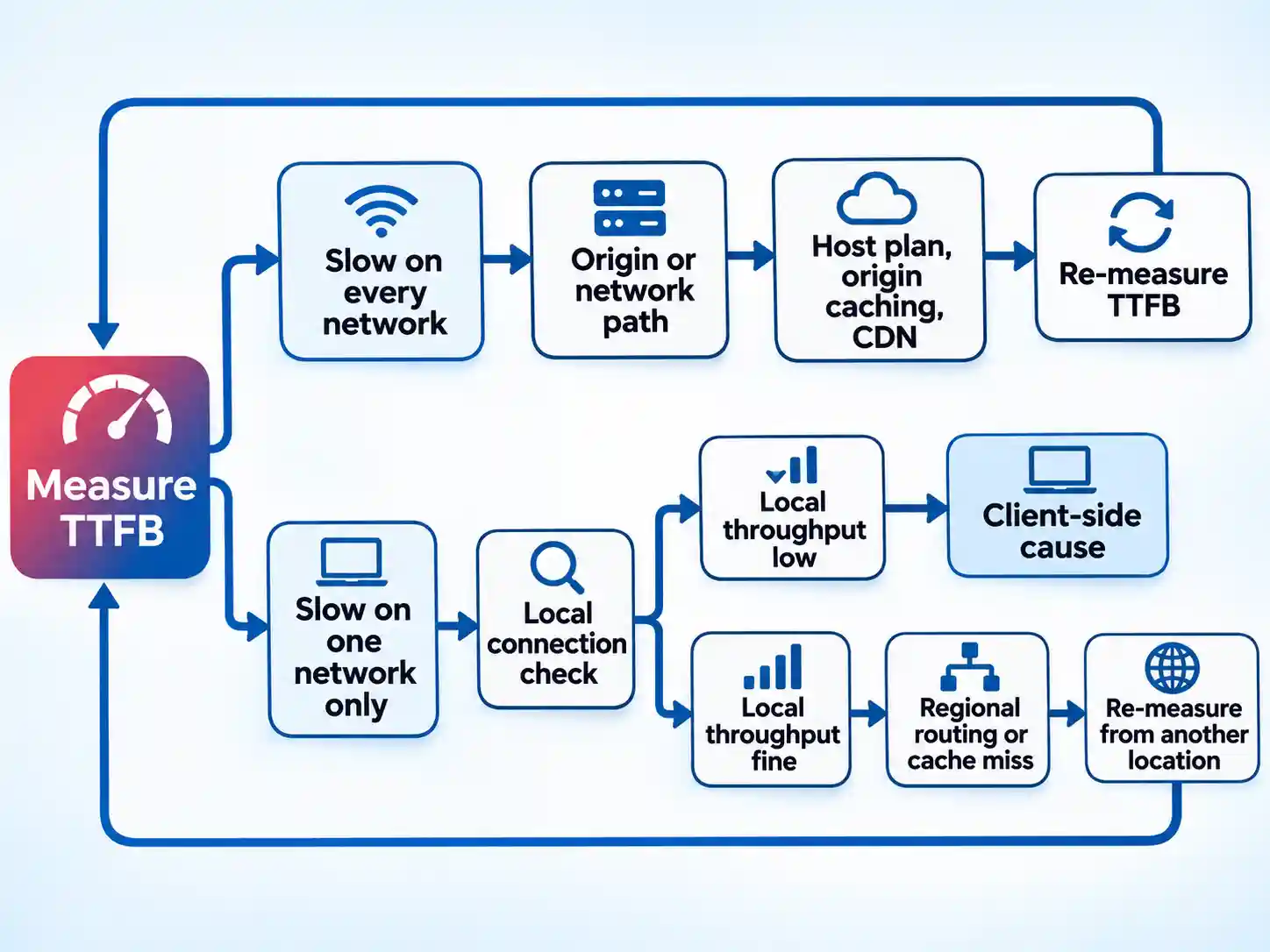
Start by measuring TTFB from more than one network. If the first byte is slow everywhere, the constraint sits in connection setup or the backend. Look at the hosting plan, origin caching, application response time, and whether a CDN is actually terminating requests close to your users.
If TTFB is acceptable in one location and slow in another, the picture changes. The difference may be network routing, a regional cache miss, or the visitor’s own connection. This is where a local broadband check helps — for example a speed test PTCL run on the affected connection. It tells you about that connection’s throughput and latency. It does not tell you how fast your server responds, because it is not measuring your server.
Only after those two branches are separated should you look at the asset layer. Check total transferred bytes, how many requests fire before first render, and whether the hero image is lazy-loaded by mistake.
Interaction Speed: Where Rich Design Quietly Fails INP
Chrome usage data shows that 90% of a user’s time on a page is spent after it loads. That is why Interaction to Next Paint exists, and why a page that looks fast on a stopwatch can still feel broken.
INP observes the latency of clicks, taps, and keyboard interactions across the whole visit, from input delay through event-handler execution to the next painted frame.
The usual culprits are heavy event handlers, long tasks triggered by a filter or menu, and third-party scripts competing for the main thread. Compressing images will not move this number. Real-user monitoring gives the clearest attribution because it identifies the interaction that was slow. When realistic interactions are difficult to simulate in a lab, Total Blocking Time can serve as a proxy, but not a substitute for field INP data.
Asset Hygiene and Delivery: Thin CSS, Deferred Scripts, Caching, and CDNs
CSS blocks rendering by default: the browser will not paint until it has built the stylesheet model. Keep critical CSS thin, deliver it quickly, and use media queries to stop non-matching rules from blocking the first render.
For JavaScript, split code so the first screen loads only what it needs, and remember that any script with type="module" is deferred automatically. That is a real reduction in critical-path work, and it is available without a build system.
Caching and CDN behaviour is configuration work that depends on your host and platform. Verify what your edge actually does with a given header before assuming a cache rule is live, and confirm that duplicated resources in intermediate caches are not adding weight you already paid for.
Which Fix Fits Which Site?
Image-heavy commerce
srcset variants at your actual breakpoints, and lazy loading below the first screen. Set an image weight budget per template.Avoid: lazy-loading the product hero or the first gallery row.
Content publishers and brand-led sites
Avoid: assuming one font-display value fixes every shift on the page.
Small DIY teams
Avoid: an AVIF pipeline you cannot support with automated fallbacks.
Global or low-bandwidth audiences
Avoid: decorative video that autoplays on every page.
Teams with rich custom interactions
Avoid: treating a lab score as proof the interface feels responsive.
When to Bring In Specialist Help
Most sites can improve substantially with image conversion, dimension attributes, and a hosting review. Specialist help becomes defensible when the interaction system itself is the problem: custom components with complex state, a design system with motion rules that no one owns, or maintenance work that keeps regenerating the same bugs.
In that situation, a UX design agency may be worth exploring as a way to rebuild the heavy components alongside the visual system. Vet the scope carefully. Ask who owns performance budgets, whether your team receives a testing process, and how the work will be measured after launch. No outside team can promise a Core Web Vitals pass on your behalf.
The Order That Usually Works
Work from the layer that is failing, and verify each change before moving to the next one.
- Establish baselines.Measure TTFB from more than one location, total transferred bytes for the home and product templates, and field data for CLS and INP where you have it.Without those numbers, prioritisation becomes guesswork, because a large asset count and a slow first byte produce different fixes.You have a baseline when the same measurements can be repeated after a change.
- Fix the layer that is failing.If TTFB is slow everywhere, address hosting, origin caching, or CDN delivery before touching design assets.If images dominate the byte count, ship a WebP pipeline with responsive variants and selective lazy loading; if the layout jumps, set dimensions and match fallback font metrics before adding more motion.Confirm the target metric moves in the right direction before widening the change to other templates.
- Verify in lab and field after each change.A lab pass can hide real-user problems, and field data alone will not tell you which asset caused them.Repeat the measurement after each change rather than after the whole programme, so each result stays attributable.When the same metric is better in both views, you can move to the next bottleneck.
- Escalate only when the remaining problem is structural.Hosting architecture, an interaction system nobody can simplify, or a design system that fights every optimisation may justify specialist help.Ask who owns performance budgets, how testing will be handed over, and how the work will be measured after launch.That handover is the confirmation cue: if nobody can own the next measurement, the structural problem is not solved.
There is no single winning tactic here, and any vendor promising one is selling a plugin. The reliable approach is layered: read the server response, control render-critical work, deliver media at the right size and format, then measure what happens after the page loads. For a broader view of why this work pays off beyond the speedometer, see how website speed can hold back SEO efforts. Keep the brand, remove the waste, and match the fix to the bottleneck in front of you.
